

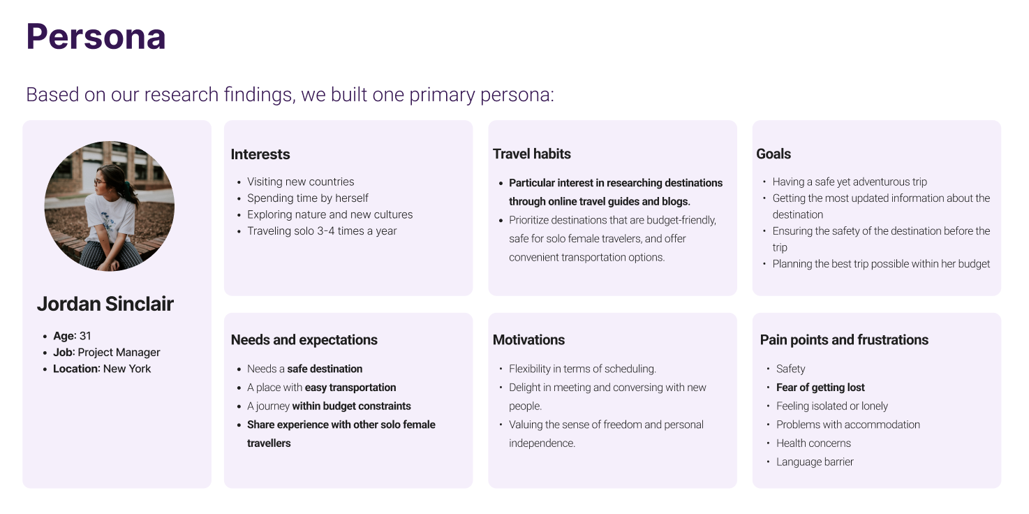
Based on our research, the number of women who want to travel solo is on the rise. Furthermore, female solo travellers face more challenges, especially in terms of their safety. That’s why we decided to focus our efforts on female solo travellers.

We analysed 6 competitors in terms of:

We sent out a survey to potential users .
We interviewed 5 college-educated women who were financially independent.
We designed a script to have semi-structured user interviews. Each interview took approximately 30 minutes.
To validate our findings of the qualitative research, we designed a survey using Google forms, based on our initial findings to find out more about the larger audience.
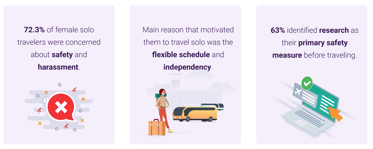
We received 49 responses.
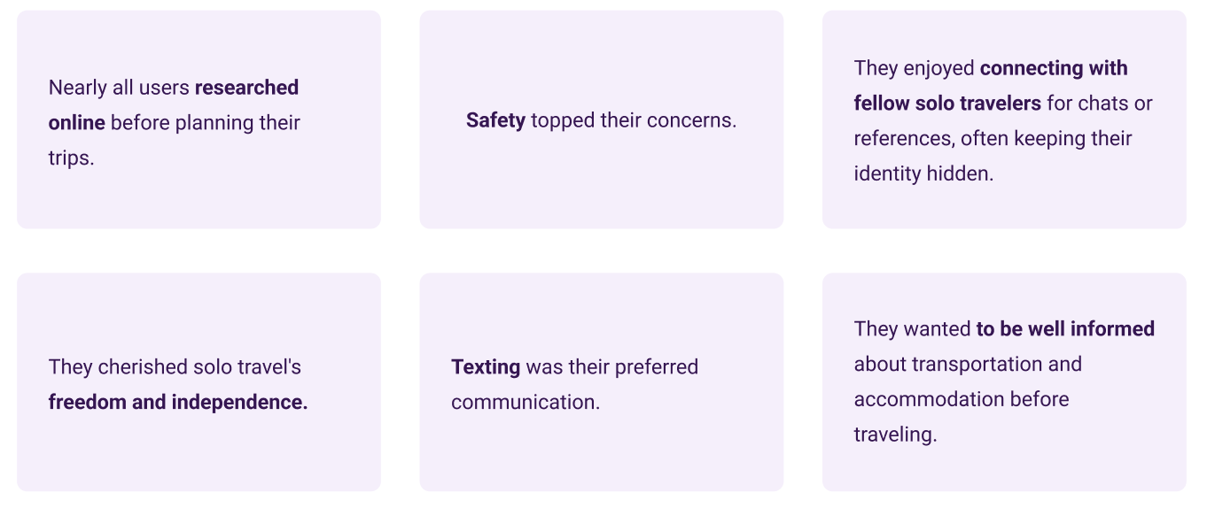
We put all of our findings on the canvas and we started to affinity mapping our findings.The main categories of the affinity map were:

To prioritize pain points of users, we used an impact/effort matrix. These are the main pain points that we decided to focus on:

As a young woman who likes to travel solo, I need to have access to the most updated information about my destination so that I can plan a safe and affordable trip for myself .

To help the ideation process, we came up with 34 “How might we...?” questions.
Each team member wrote down their ideas.We came up with over 20 different ideas. Below is our top-scoring design solution.

We help female solo travelers find safe affordable trip plans by offering a social media app where they can share & find the most updated information about various trip plans.

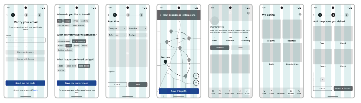
We created an IA to map out the whole design.We wanted to help users achieve their goal by providing structure, consistency, and an easy-to-navigate interface.

We designed low-fidelity wireframes with lots of iterations and discussions.Then we turned them into a mid-fi prototype to get ready for usability testing.
We conducted moderated remote usability testing with 5 participants.We prioritized their feedback based on the value/effort of each change.

We chose the “Orbit” design system for our work, which is a design system for travel apps. We confirmed the compliance of the design system with WCAG2 & APCA accessibility guidelines. We decided to build a native iOS app and we adjusted our design system based on this decision.

We believe the reason that we managed to do so much quality work in a short period of time are the followings:
In my UX project, I designed a user interface from scratch. This was a time-consuming process, and I realized that I could have saved a lot of time by using a design system.
A design system is a collection of reusable components, design patterns, and guidelines that can be used to create consistent and user-friendly interfaces. By using a design system, I would have been able to reuse existing components and patterns, and I would have had a clear set of guidelines to follow. This would have saved me a lot of time and effort, and it would have helped to ensure that my design was consistent and user-friendly.
If I were to do this project again, I would start by designing a comprehensive design system. This would involve defining the core components and patterns that I would need to use throughout the project, as well as creating a style guide to ensure that all of the components are used consistently. Once I had a design system in place, I could start designing the user interface, using the components and patterns from the design system.
By designing a better design system, I could have saved a lot of time on the task. I could have also reused the design system for other projects, which would have saved me even more time in the future.

If you like what you see and want to work together, get in touch!
yanli006@gmail.com